A premium visual direction and UI system for a rebrand.
My Role
UI/UX Designer leading a UI-focused redesign: competitive benchmarking across Colombia, the US, and Europe, visual direction exploration, and delivering the approved design system foundation.
Overview
Novu Eats (formerly Enjoit) had a working product but an interface that looked generic and inconsistent. In food delivery, how the app looks directly affects whether people trust it enough to order. The existing UI wasn't there yet.
The goal was to define what "premium" looked like for this product and turn it into a UI system that could hold up across a large, multi-vertical app, without needing to start over every time something new was added.
Outcome
The Clean visual direction was approved by the client and adopted as the base for the full redesign across the entire app, chosen specifically for its scalability and premium feel.
Overview
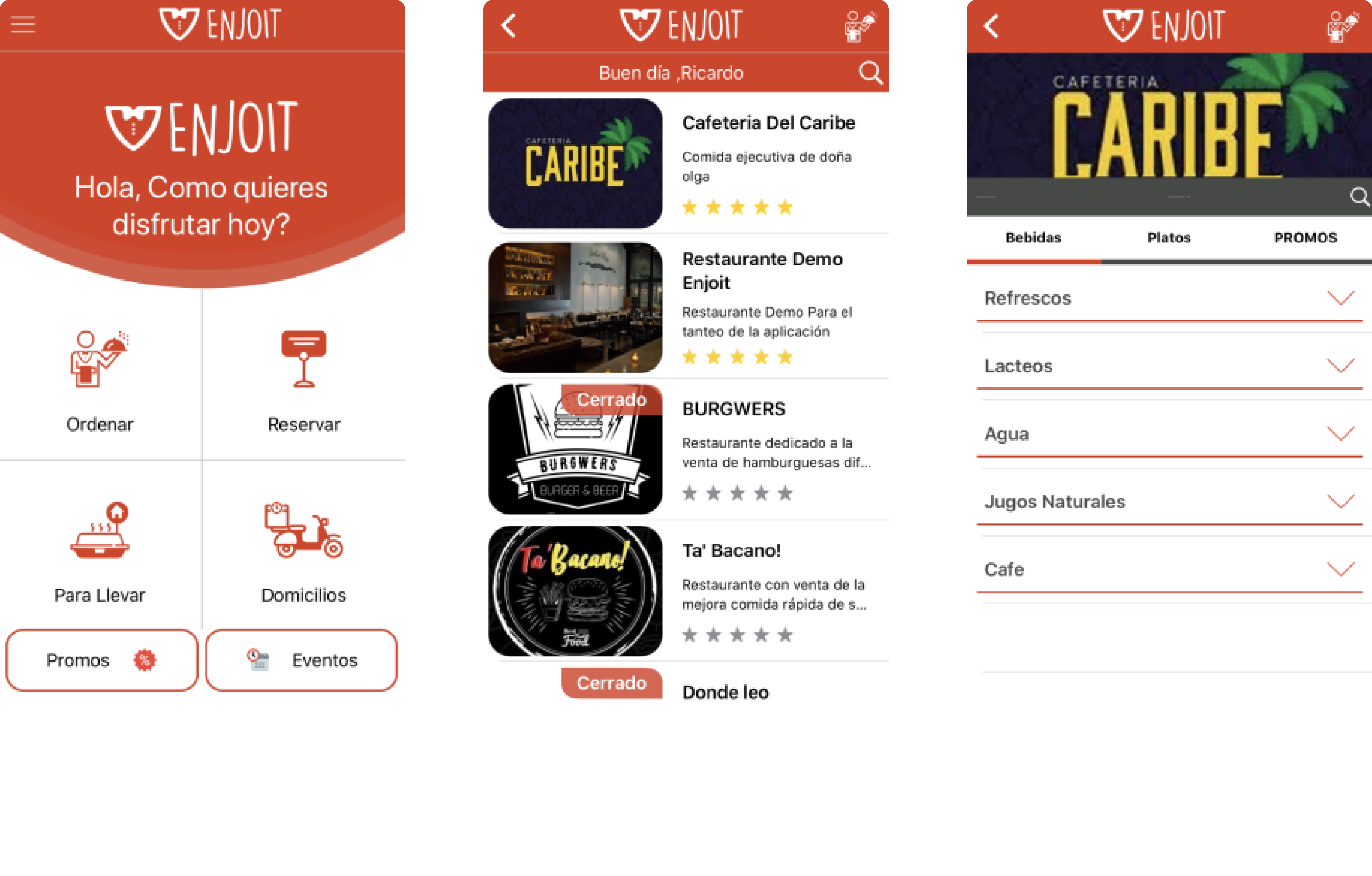
Novu Eats (formerly Enjoit) is a multi-service delivery app that includes restaurants and additional verticals. The product was already functional, but the interface lacked identity and felt behind compared to competitors. In food delivery, how the app looks directly affects whether people trust it enough to order — the existing UI wasn't there yet.
The goal was to define what "premium" looked like for this product and turn it into a UI system that could hold up across a large app.
Outcome
The Clean direction was approved and used as the base for the full redesign. The style was chosen specifically because it could grow with the product without needing to start over every time a new section was added.
01 - Discovery & Research
The main challenge was not usability in isolation, it was perception and competitiveness. The current UI looked generic and inconsistent, and it did not communicate the product quality needed to compete in delivery.
I started with a market study focused on apps with strong adoption across Colombia, the US, and Europe. Instead of collecting screenshots, I extracted patterns that consistently shape modern delivery experiences:
→ Visual hierarchy: how top apps prioritize search, categories, promos, and primary actions.
→ Content strategy: image-first vs text-first browsing, density, card anatomy.
→ Brand expression: restrained vs expressive use of color, surfaces, icon systems.
→ Conversion cues: promo tags, "closed" states, pricing hierarchy, CTA prominence.
→ Navigation patterns: tabs, quick filters, sticky headers, scannable lists.
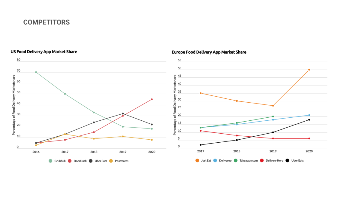
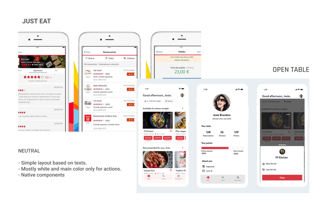
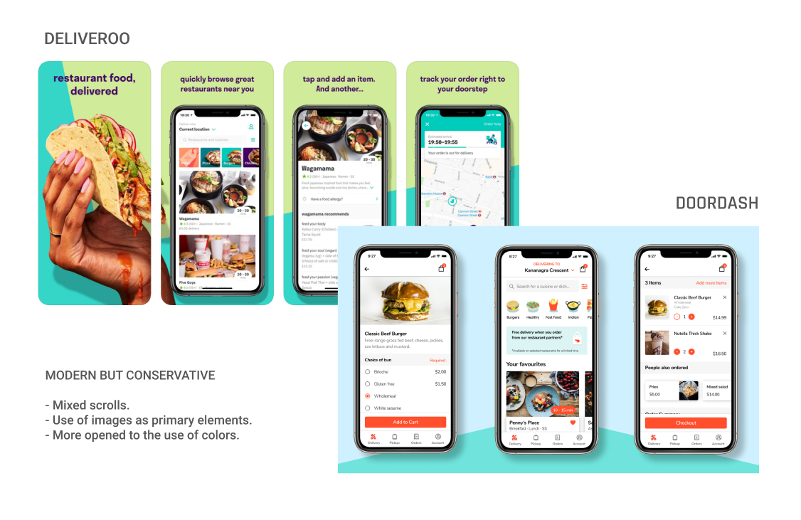
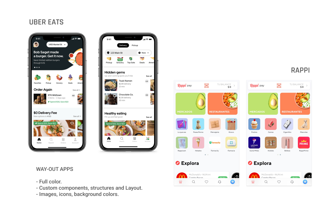
This analysis created a clear baseline: what "good" looks like in the category and what Novu Eats needed to match or surpass.
02 - Ideation & Strategy
Rather than jumping into a single redesign, I created three UI directions to accelerate alignment. Each one was tied to a persona and a specific ordering mindset, premium browsing, deal-driven decisions, or playful discovery, so the visual identity could be chosen with clear intent.
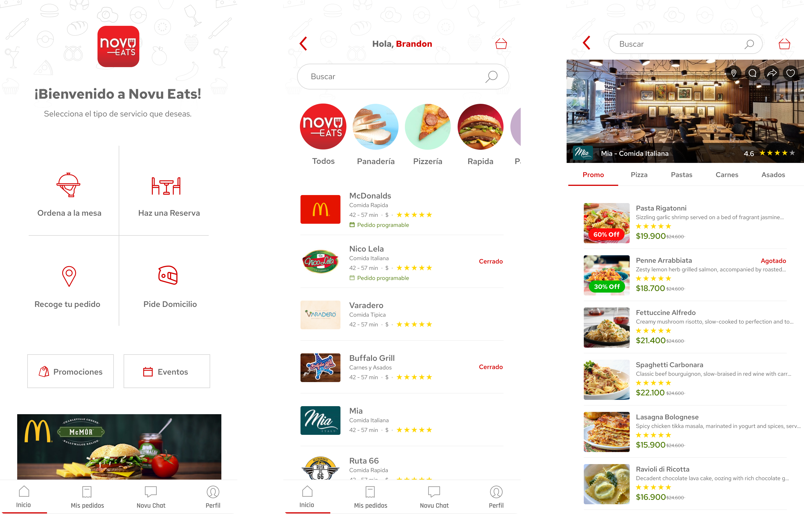
Direction A - Clean (Premium + Scalable)
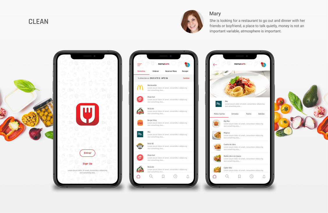
A restrained and modern UI designed to feel premium while remaining highly scalable.
→ White-first surfaces and strong typography hierarchy.
→ Color used primarily for actions and key emphasis.
→ Image-forward moments where they increase appetite appeal.
→ Consistent spacing and predictable components.
Direction B - Promo (High Conversion Energy)
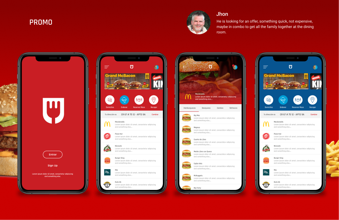
A stronger promotional look designed to push deals and urgency.
→ Bold promotional surfaces.
→ Higher contrast and heavier brand dominance.
→ Optimized for scanning offers quickly.
Direction C - Fun (Expressive + Playful)
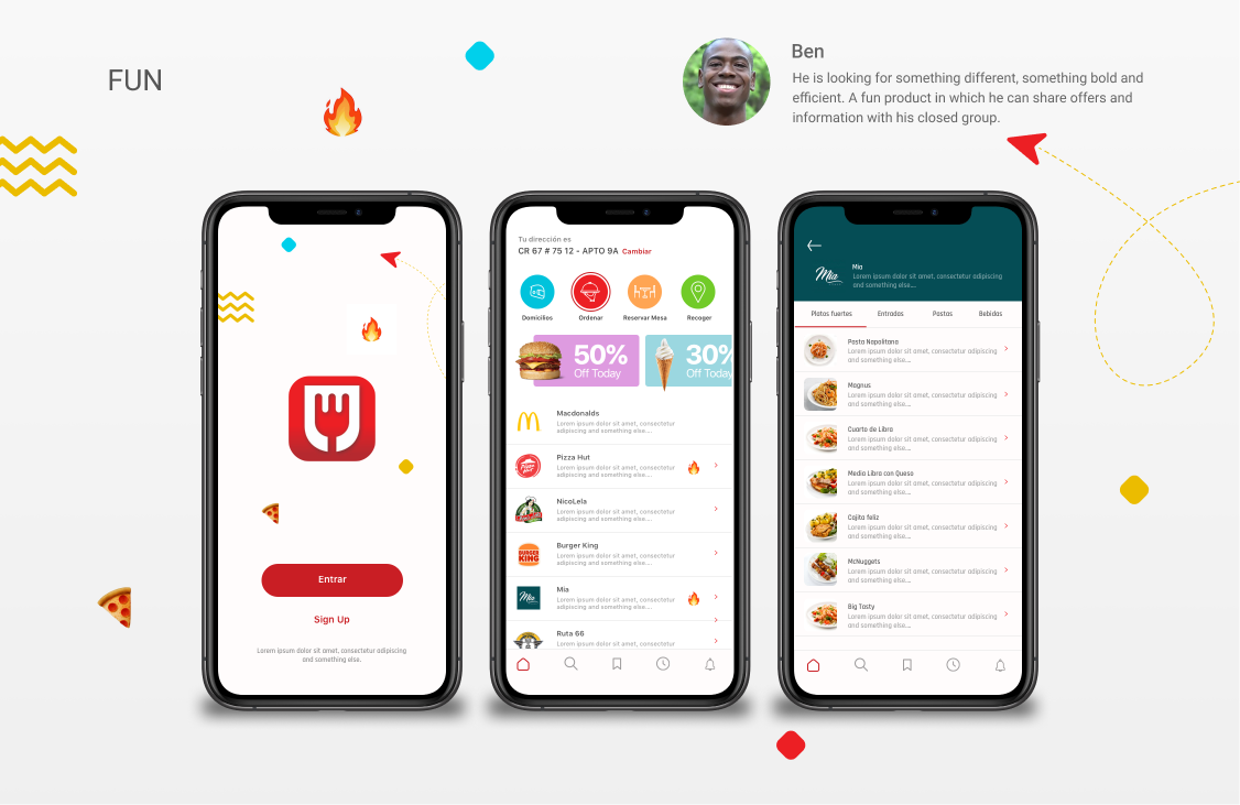
A more personality-driven direction designed to feel bold and different.
→ Decorative elements and vibrant accents.
→ More branded surfaces and playful composition.
Decision Criteria
To support decision-making, I evaluated each direction against criteria that mattered to the business:
→ Scalability across verticals and new features.
→ Premium perception and trust.
→ Clarity and speed-to-order.
→ Consistency potential across a large app.
The result
The client chose Clean, explicitly because it felt "premium" and favored business scalability.
03 - Design & Systemization
Once the direction was chosen, the focus shifted from designing individual screens to building something reusable.
Design Decisions
The following choices were essential to make the Clean direction work as a system:
A consistent card anatomy for listings (logo/image, rating, ETA, status, price cues).
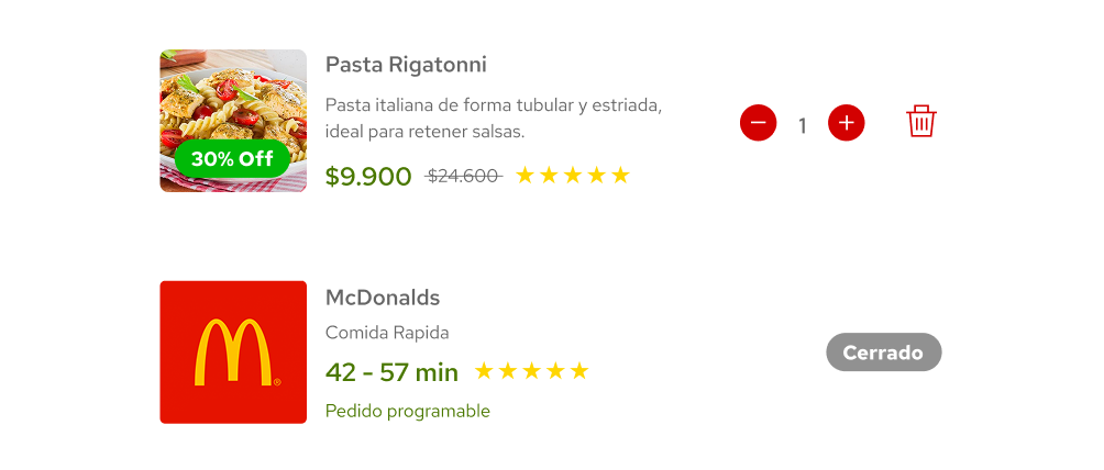
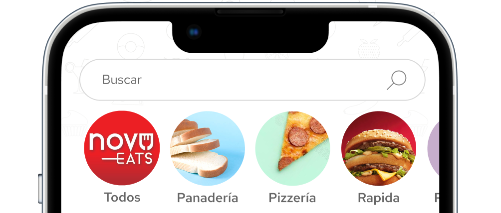
A clear search + category entry pattern to reduce friction at the top of the funnel.
Restrained color usage so the interface stays premium and readable at scale.
Consistent surfaces and spacing rules so dozens of flows could share the same foundations without looking off.
Deliverables (UI-focused)
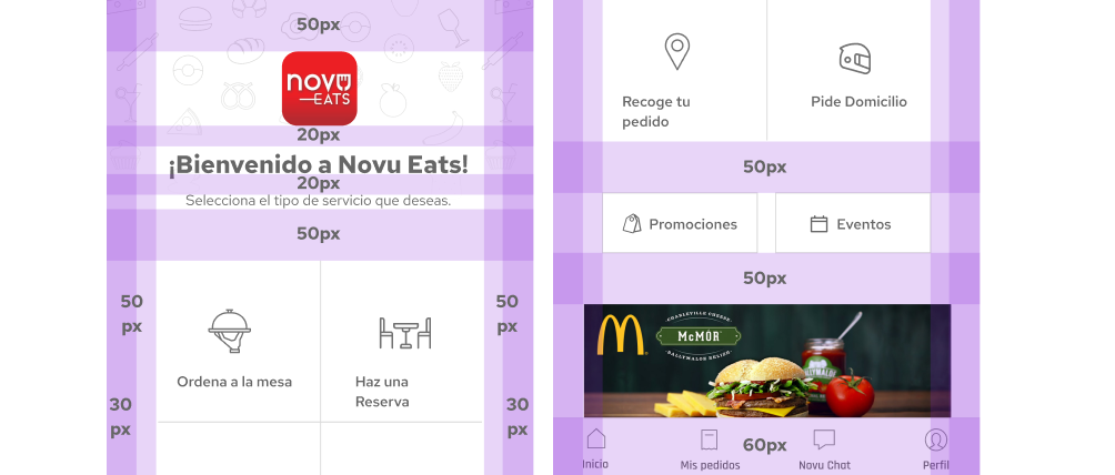
→ Component foundations (navigation, headers, search, cards, promos, tabs/filters).
→ High-fidelity UI for key surfaces that demonstrate the system in real use.
→ A direction-ready visual baseline used later to redesign the full app (checkout, tracking, GPS, etc.).
04 - Alignment & Approval
The three-direction approach helped the client make a confident decision early, and the Clean style reduced subjective debate because it was evaluated through scalability and premium perception.
Once approved, it became the reference for the whole redesign, keeping everything consistent across a very large scope.
Before vs After (UI Direction Shift)
Drag the divider vertically to compare the previous UI with the redesigned Novu Eats interface.
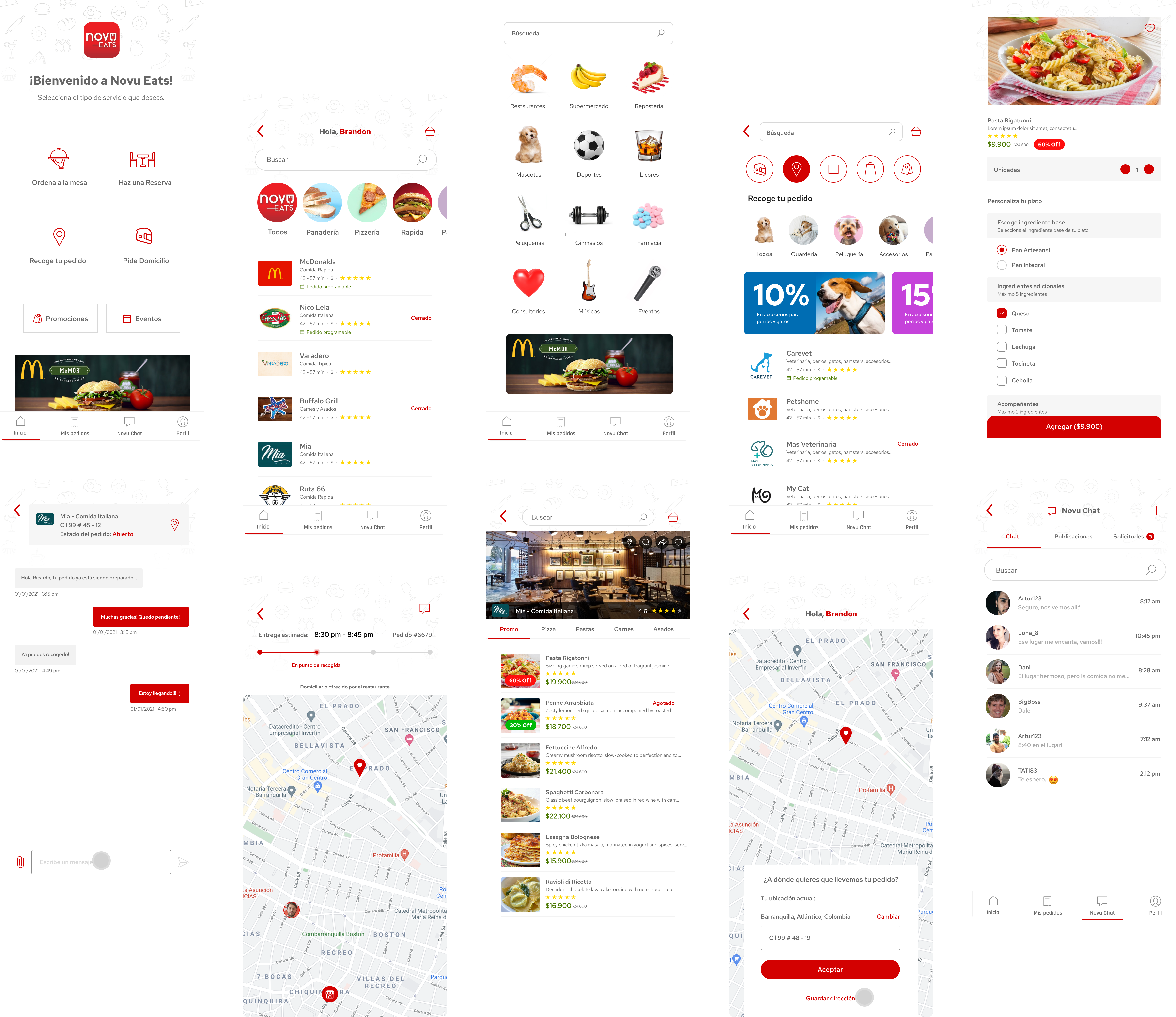
05 - Final UI (Approved Direction)
Clean became the base for everything: premium, calm, and easy to extend. The final UI focused on clear hierarchy and consistent patterns for browsing, picking a restaurant, and ordering, built to grow with the product.
06 - Measurement Plan (Post-launch)
Since this was a freelance engagement, I didn’t have access to post-launch analytics or iteration cycles. To evaluate the impact of the new visual direction, I recommended tracking:
→ Conversion rate from listing → menu → cart → checkout
→ Drop-off rate by step across the ordering funnel
→ Time to first meaningful action (search / category tap / restaurant open)
→ UI-related app store review sentiment (clarity, trust, premium feel)
→ Rating trend before vs after the redesign release
07 - Key Takeaways
→ Visual direction is a business decision. "Premium" in delivery is not decoration, it builds trust and supports conversion.
→ Three strong directions accelerate alignment. Exploration reduces opinion-based cycles and makes trade-offs explicit.
→ A UI system outlasts any individual screen. Consistent components mean the product can grow without starting from zero every time something new needs to be added.